
You may have never heard of this APP before, but,
the Beyond APP is the Top 1 Cross-Border E-Commerce platform directly shipping fashion goods from North America and Europe to Chinese consumers.

Product:
Company:
Business:
Customers:
2B Partners:
My Role:
Beyond APP
BorderX Lab, founded in Silicon Valley
Cross-border e-commerce platform
Chinese middle-class
NA and EU merchants / brands
UX Director
A part of the merchant partners


REDESIGN THE FIRST-MILE FOR
CROSS-BORDER E-COMMERCE
Beyond APP is the top-ranked cross-border e-commerce platform directly shipping fashion goods from North America and Europe to Chinese consumers

When
2018.10-2019.03
Role
UX Director working with a team of designers
Solutions & Key Results
01/New Users' Zone Redesign
15.46%
02/Expose Promotions/
Benefits Information
9.4%


First-Order Conversion Rate
First-Order Conversion Rate

CONTEXT
KEEPING UP WITH OUR DIVERSE USERS
Rapid Growth Led To A Larger User Base & New User Needs
In 2017 and 2018, the product (Beyond APP) was in a period of rapid growth.
Users were more diversified, and new user needs were formed. These new needs weren't accounted for initially, which created the need to rethink the user experience.

Beyond App’s Life Cycle in 2018
PROBLEM
WHY IS IT IMPORTANT TO
REDESIGN THE FIRST-MILE EXPERIENCE?
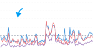
NPS Score Dived From 65.55 To 26.68
We observed surging negative feedback through the NPS survey in August 2018.

26.68 was the NPS score of Beyond APP in August 2018
65.55 was the NPS score of Beyond APP in March 2018
26.68 was also lower than most of the competitors of Beyond APP, including Kaola, Amazon China, Mia, Taobao, JD, etc.
NPS Survey Report in Aug 2018
Users Experienced Frictions While Placing Orders
A questionnaire was sent out to collect in-depth feedback from users. Three main unfulfilled user needs were uncovered.
Users couldn’t find products efficiently
Users needed more basic info for purchasing decisions
Users had a few major concerns/frictions in the order placing process

User’s Pain Points In The User Survey Of August 2018
MY ROLE
My role was the UX director, managing 4 product designers, 5 UX designers, and 3 marketing designers at that time. I led the design of all the products in the company, including 2C products on various platforms and 2B products.
In this project, my role was to initiate and led the project to achieve success end-to-end.
Design Strategy
I initiated this project after having observed the user needs and business impact.
Project Management
I managed the project timeline, and co-worked with PMs and engineer leaders to ensure the project remained on track.
Advocate & Alignment
I enlightened designers to work on the project. I uncovered the insights with stakeholders and aligned with them.
Design Process
I led the design process and drove the execution of feature creation, research, wireframes, prototypes, and design specs.
Leadership
I shared the insights, design philosophies, and key results to gain buy-in from the CTO, executives, engineer leaders, and senior stakeholders throughout the project journey.

Whiteboard Writing On The Project Initiating Meeting With Designers
MAIN AUDIENCE & IMPACT
FOCUSING ON 0-ORDER USER GROUP & INCREASING FIRST-ORDER CONVERSION RATE
Leveraging the RICE Framework and accounting for the company strategy and market environment in China, I defined the first-mile experience improvement project.

0-Order Users Had More Pain Points
1st-Order Conversion Rate Was Low
40% Of Total GMV From New Buyers
Increasing Customer Acquisition Cost

User Group Analysis of NPS Survey
Order Conversion Rates
A 20% 1st-order CVR improvement could increase 9% of total GMV.
*GMV stands for Gross Merchandise Value,
If the 1st-order CVR got increased by 20%, the CAC could be decreased by around 10%.
*CAC stands for Customer Acquisition Cost
I shared the potential impact with the marketing team and the product team, who were responsible for the new buyer acquisition and order conversion rate respectively. I shared the project with our CTO too, who was my direct manager. Being supported by them, this project was officially initiated.
SCOPE & CONSTRAINTS
SEARCH + FILTERS IS NOT AN OPTION
Based on the communications and feedback from teams, CTO, and other colleagues, the designers and PMs defined the scope & constraints of this project.
Scope
New features, redesigns, and iterations directly related to the 0-order user journey of exploring products and placing an order were in scope.
Post-sale journey, improvements not mainly focusing on 0-order users were out of scope.
Constraints
The major constraint was that the search+filters solution wasn’t an option as it would take more than 6 months and require tremendous resources.
No supply strength change; No extra subsidies.
We expected to launch the major improvements in 3 months.
USER RESEARCH
USER NEEDS VARIED BETWEEN
INEXPERIENCED SHOPPERS & EXPERT USERS
Inexperienced Overseas Shoppers Became Dominant
As the user base surged from hundreds of thousands of millions, the dominant users shifted from expert users to inexperienced overseas shoppers. And, the supply side development brought more market competitive categories on the Beyond App, users’ needs became more diverse.

Users and Supply Change Due to the Growth
To understand the emerging diverse users’ needs and the frictions they were facing in the shopping journey, we recruited 25 users of various groups.
-
5 new users who had never downloaded the Beyond APP
-
5 newly downloaded but hadn’t placed orders
-
5 existing customers (3 active customers & 2 churned customers)
-
10 newly downloaded users in Tier 3, 4 cities (phone interview)
Inexperienced Overseas Shoppers Needed More Product Recommendation & Overseas Shopping Knowledge
Inexperienced overseas shoppers experienced more pain points in the Beyond APP: they struggled to find the desired products, they didn’t how to choose the U.S. sizes, they tried to understand the customs duty, and they often canceled purchases because of the high international shipping fees.

Part of the User Interview Notes

Usability Test & User Interview

Pain Points Priority

User Shopping Patterns

Frictions On Shopping Bag
INSIGHTS
FINDING VALUABLE POPULAR PRODUCTS
The challenge, at hand, was to lead the team to prioritize a focus area based on the insights collected. I led the team focusing on one main challenge in this project--
“How might we help inexperienced or minor-experienced 0-order users find valuable classic products of a certain category and brand?”
Regarding this challenge, 4 insights we had and kept in mind in the following processes.
Insight / 01
Users usually start their shopping journey from finding products in a category or a brand.
And, many times they’d like to find products in a category and a specific brand.
Insight / 03
35% of newly downloaded users often ignore the new user coupon information when they open the APP for the first time.
Insight / 02
A large portion of 0-order users have a rough idea about buying a product from a certain category or a brand, but they don’t know which one is worthy of buying.
Thus, they tend to look for popular products. And, for them, “popular” means “classic.”
Insight / 04
Most of the 0-order users are price sensitive, with an annual income of no more than $25,000.
IDEATE
3 FACTORS TO 2 SOLUTIONS
3 Factors
First, we synthesized the insights into 3 factors:
-
Finding products of a category & a brand
-
Classic
-
Valuable
1) Building across categories/brands shopping scenarios on high-traffic pages;
2) Optimizing the product ranking algorithm to recommend “classic” products;
3) Exposing “valuable” information throughout the user journey, especially on the product listing and detail page.
And we ideated on each factor and determined:
2 Solutions
To build across categories & brands shopping scenarios, 1 UX designer analyzed the high-traffic pages/sections in the app, and we prioritized the New Users’ Zone redesign.

Originally Drawn by Yuxin, I Optimized it For the Case Study
And we analyzed the “valuable” benefits 0-order users could have. In the end, we defined 2 solutions.
Solution / 01
New Users’ Zone Redesign to recommend popular products of high-demand categories/sub-categories/brands.
And, optimizing the product ranking to prioritize the classic products.
Solution / 02
Expose “valuable” info on product detail page and product listing page to help raise user awareness of the great price they can have.
Also, put “valuable” info on every section/page of the 0-order user journey.

SOLUTION 01
NEWCOMER’S ZONE
REDESIGN
Key Results
-
Overall 1st-Order Conversion Rate increased by 15.46%
Sections/Pages
-
Newcomer’s Zone Entrance On Homepage
-
Sneakers & Streetwear Landing Page
-
Fashion Landing Page
-
Beauty & Skincare Landing Page
-
Mom & Baby Landing Page

.png)

The entrance of the New Users’ Zone was on the first screen of the homepage, we increased the exposed categories on it.


Before
Entrance of Newcomer’s Zone Landing Page
Authenticity Education
After

Contrast the key information of categories and promotions
Simplified the coupon claiming bar to focus on the $188 benefit and CLAIM action.
Categories exposed in the New Users’ Zone grew to 8 from 2 to meet users’ diverse category needs.
Exposed high-demand sub-categories on the homepage to shorten the user path, i.e., High Street, Watches, etc.
Be inclusive by giving options for different genders and demands, even though some categories were not high-demanded, i.e. Baby, Men’s.
Lessen the users’ cognitive load by removing the unnecessary information, such as item quantity, go-to-buy text, authenticity education, and so on
Higher demand, larger spaces
We also redesigned the landing pages for the high-demanded categories to build the cross category & brand shopping scenarios, and recommend valuable classic products.
Take the Fashion category landing page as an example here.
Before

After

The authenticity education information was reorganized here.
Made recommendations for valuable classic products to help 0-order users find products worthy of buying.
Created brands’ sections in the Fashion category landing page because users tended to look for products from their favorite brands.
Broke down the brands into two sections - affordable luxury and luxury - for the interests of different users.
Built sub-category tabs for more specific user needs.
Category navigation bar at the bottom of the page for easily browsing other categories.

Key Results
Overall 1st-Order Conversion Rate increased by 15.46%
The design team worked closely with product managers throughout the project, from high-level strategy to product ranking details.


Wireframes of Fashion Landing Page, Beauty & Skincare Landing Page by Jiahui
Wireframes of Sneakers & Streetwear’s Landing Page by Chenchen Tong
Fashion Page

Beauty&Skincare Page

Sneakers & Streetwear’s Landing Page


-
For the Sneakers & Streetwear Landing Page, the 2nd design’s key point was optimizing the filters functionalities for sizes, popular brands, and popular sub-categories.
-
-
The hot-selling items usually have only a few sizes left, so the size filter could help users filter out the items that don’t have their size available.

SOLUTION 02
EXPOSE “VALUABLE” INFORMATION

Key Results
-
First-Order Conversion Rate increased by 9.4%
-
0-Order User Product Listing Page Conversion Rate increased by 11.72%
-
0-Order User Product Detail Page Conversion Rate increased by 5.37%
-
New User Register Rate increased by 13.65%
Main Pages
-
Product Detail Page
-
Product Listing Page


What is a valuable product? This is the first question we asked ourselves.
-
For some users, a valuable product means it’s the lowest price;
-
For some users, a valuable product means its price is lower than other platforms at the same time;
-
For some users, a valuable product means it has a discount, or a coupon can be applied on, so they feel it’s valuable.
We brainstormed on the existing discount and benefits the Beyond APP already had for each definition of a valuable product, and we had a list of them on hand.

What is a valuable price?
Before


After

The Historical Lowest Price / 3-Month Lowest Price tag was displayed to inform users
Highlighted the New Users Exclusive Reduction
Added New User Register Guidance to encourage users to sign up and get a more valuable price
After

The valuable info was also listed on the product listing page
Contrasted the benefit visually to emphasize that benefit and the value of the present price

Key Results
-
First-Order Conversion Rate increased by 9.4%
-
0-Order User Product Listing Page Conversion Rate increased by 11.72%
-
0-Order User Product Detail Page Conversion Rate increased by 5.37%
-
New User Register Rate increased by 13.65%
ITERATE
A/B TESTING IS NOT ONLY A BINARY POSITIVE OR NEGATIVE RESULT
Ensuring Our Improvements Don't Impact Other Features Negatively
A/B testing tells us more than giving positive or negative, significant or insignificant results. The detailed data tells the iteration directions.
Before
After

Iterations
This design increased the New Users’ Zone’s 1st-order CVR.
However, it decreased the overall 1st-order CVR.
Through the detailed data, we realized the reason was that the length of the New Users’ Zone almost pushed the Hot Sellers almost off the first screen, which was another major source of GMV.
We quickly added 3 categories to the New Users’ Zone since we had observed the needs for multi-categories from users.
It increased the 1st-order CVR, but not significantly.
THE IMPACT
UX REDESIGNS BOOSTED THE BEYOND APP IN SCALING THE MARKETPLACE
The first-order conversion rate was increased by more than 20% in total.

These improvements increased the marketing spending efficiency by around 15%, which rapidly boosted the scaling of Beyond APP.

These outcomes also earned the design team credibility and partnership with other teams, improved our team members’ morale, and helped me build leadership skills.


REFLECTIONS
WHAT I LEARNED
Changes In Main Business Factors Require In-Depth User Research
We created scores of online chatting groups to collect users’ feedback. The design team regularly conducted the NPS survey.
However, if we hadn’t interviewed these 25 users, we would have never known many of the pain points with which users were struggling.
We observed frictions from the NPS user survey this time. Based on this experience, we can anticipate the necessity of in-depth user research when main business factors change in the future.
Incremental GMV = Increased GMV - Decreased GMV
Increasing the key metrics of the section/page you have redesigned/designed is great, but make sure that the improvement of one part won’t harm other parts or the overall revenue.
With this experience, when I was in the same situation, I considered more about the design’s impact to the overall performance.
Understanding the Business & Empathizing With Teams
Understanding the Beyond App’s business helped me define the impact of this project. Understanding every business team’s key objectives helped me more easily get supported by them.
And, a clear goal could vary for different team. A clear goal for the design team could be the impact on user experience and a clear goal for business teams could be the impact on key metrics. Advocating for different people with different but clear goals was another strategy I used in this project.
THE BIGGER PICTURE
OTHER OUT-SCOPE PROJECTS
More Categories Across Brand Shopping Paths Were Built

Size Localization And Normalization

EU Sizes On Product Detail Page

Foot Size Measure Guidance
More than 50% of users didn’t know how to choose US/UK sizes but all of the users knew their “Chinese New Sizes,” which is very similar to the EU sizes.
Later on, 1) we changed the default sizes to EU sizes; 2) we encouraged users to fill in the size of their feet in centimeters to get accurate sizes in each country’s size system; 3) collected size charts of more brands.


Overseas Shopping Knowledge Education

Exposed information of authenticity on the product detail page.
Let users know the shipping period before they place orders.
This was an epic project. The design philosophy was to help users gain knowledge at every step when necessary.
The educating information was composed by various teams.
Above are three examples. The total work was more than these.
Other Business Operation Improvements
I shared insights with co-founders, executives, and managers. More improvements were executed in the company, including customer service improvements, package reinforcement, negotiating with merchant partners to decrease the order cancellation ratio, and much more.

MORE PROJECTS


