2013.05 - 2013.12
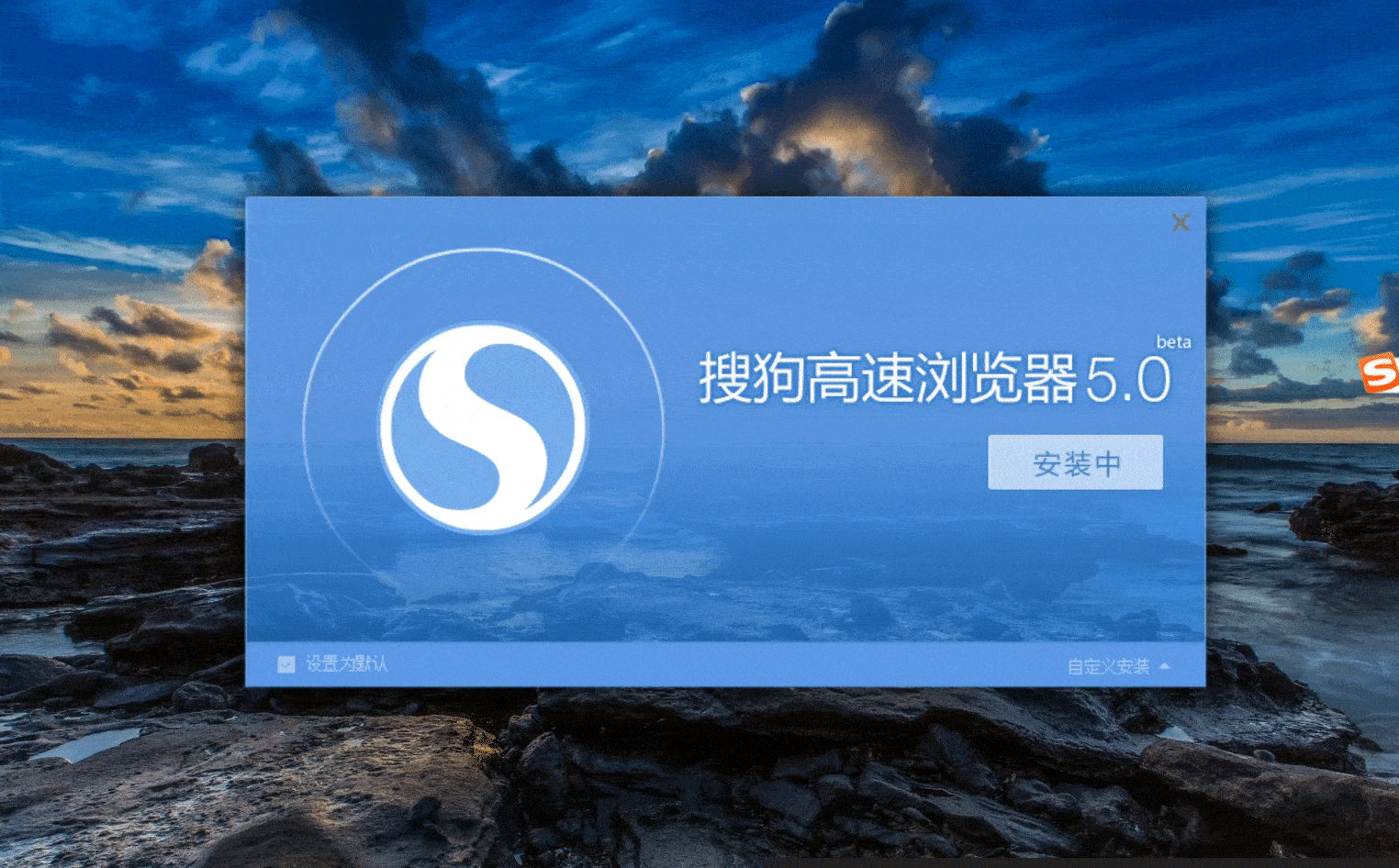
MODERNIZING A CHINA’S
HIGHLY-RANKED WEB BROWSER
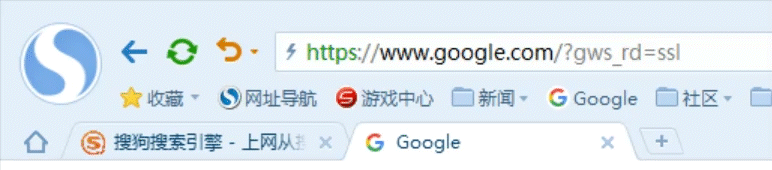
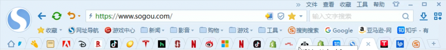
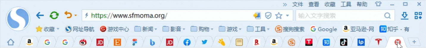
Old Version

New Version

CONTEXT
SOGOU WEB EXPLORER RANKED IN TOP 5 IN CHINESE MARKET
Sogou Inc. ranks as having the fourth-largest user base in China’s high-tech industry.
Sogou Explorer was one of the three main products of Sogou Inc in 2013. It was first launched in December 2008. From 2008 to 2013, the team was mainly focusing on tech investment.
In 2012, a designer of another product supported to have designed a new default skin in V4.0, which didn’t get buy-in from users. The team felt it was necessary to work with a designer closely and to upgrade the user experience.
This case study only contains open data.

Sogou Explorer V1.0, 2008

Sogou Explorer V4.0, 2013
MY ROLE
THE DESIGNER LED THE PROJECT E2E
I was the UX lead of Sogou Explorer (Mobile) from 2012 and was responsible for the design of Sogou Input Tool (iOS).
In May 2013 I began to work with the Sogou Explorer (Desktop) team since they requested design resources for the UX upgrade.
I became the UX lead of Sogou Explorer (Desktop & Mobile) in 2013 after the successful UX upgrading of Sogou Explorer (Desktop) V5.0.
In this project, my roles were:
-
Defined the UX strategy with the management team
-
Designed the IA, interactions, UI style, motion effects, etc.
-
Led 2 UX designers to design a few features by the end of this project
-
Implemented the designs with engineers
-
Conducted the usability test with the user researcher and iterated designs
-
Led 1 UX designer to compose UX guidelines after the launch of V5.0

Stakeholder Map
PROBLEM
SOGOU EXPLORER CHALLENGED USERS’ COGNITIVE LOAD
Sogou Explorer challenged users’ cognitive load:
-
The redundant information and elements
-
The unclear concepts and irrational IA
-
The out-of-data mental models
-
Advanced features stacked on the initial interface

UX STRATEGY
SHIFTING OUR FOCUS TO NOVICE USERS INSTEAD OF EXPERTS
The team was over indexing on expert user feedback and ignoring novice users.
There was a Sogou Explorer Online Forum, where high-end users complained about their pain points. Our engineers then worked to solve the problems. But, the high-end users comprised only a small portion of all users, and their needs were different to novices.
At the end, I defined the core users and design strategy with the Sogou Explorer’s team.
-
Core audience: Highly-educated young adults and novice users.
-
Empower tech-savvy individuals with all the system capabilities.
Tech-Savvy Users
Novice Users
Highly-Educated Young Adults


“How might we make the browser appeal to everyone, instead of just expert users?”
SCOPE & CONSTRAINTS
NARROWING DOWN THE SCOPE
Constraints
7 months, nearly only one designer
Scope
Sogou Explorer team told me: The only constraint was that the design wouldn’t need new system capabilities. But with the tight timeline, I limited the scope to:
Initial Interface
IA, layout, visual style, motion effects: everything was in scope.
Key Components & Features
For key components & features, IA, interactive experience, and visual style, everything was in scope.
Skins&Themes
The new design must support the customized skins&themes.
Other Components & Features
Consistent on the visual level; other aspects would be iterated after V5.0.

SOLUTIONS
01 / Simplifying the interface
02 / Key features & new features
03 / Fresh the UI
SOLUTION 01
SIMPLIFYING THE INTERFACE

Step 01 - Redefined IA & Aligned With The Team
I had many conversations with the Sogou Explorer team and conducted a card sorting session to have the new IA. We defined 8 main modules on the initial interface.
Restructured Layout of the Initial Interface


Card Sorting with the Sogou Explorer Team and Designers
Step 02 - Validating Mental Models
Card sorting research to understand the mental models of our core audience, highly-educated young adults.

One Card Sorting by a User, Anhe Guo Conducted the Research
I led the designers to conduct a competitive research to understand the novice users’ existing mental models.

Part of the Competitor Research Report, Hongzhen Qu Also Contributed to This Research
After synthesizing all the insights and defining the new UI style, I designed the new initial interface.

Step 03 - Evaluating the New Designs & Iterations
A user researcher helped conduct a qualitative usability research to verify the new design was easy-to-use for most users. We recruited 12 users who represented 3 core personas.

Usability Test & Interview (Objectives & Tasks)

Part of the Usability Test Report by Anhe Guo
Finding 01
Homepage - A Familiar Design Accepted by Users

Old Version
Moved the homepage icon on the tab bar.
New Design
3/4 participants easily found the homepage icon, 2 of them thought the icon could be larger and more easily clickable.
Feedback:
Iteration:
We monitored data after the release: the click rate of the new homepage icon didn’t drop.
We enlarged the icon by 1 more pixel, and the click rate was increased by 2%.

New Design Iteration of New Design
Finding 02
Extensions - The Unfamiliar Icon Affected Usability

Old Version
Packed the extensions into an icon as the entrance.
We split the “Tools” to 2 concepts:
“Basic Tools” and “Extensions.”
New Design
7/8 participants couldn’t find the new Extensions icon.
Feedback:
Iteration:
We reserved the new concept of “extension” and the new icon.
Adopted the previous location and exposed extensions by default.
The new design was included in the customized layout, high-end users could use it on their own.

Iteration - New Name & Icon in the Previous Location

Iteration - Extensions in the Customized Layout
Step 04 - Retaining Existing Users, Empowering Expert Users
At first, the initial interface was mainly designed for young adults and novice users. Based on that, we also considered the existing users’ and the expert users’ experiences.
-
For existing users, we inherited the layout if a user had customized it.
-
For expert users, we upgraded the customization layout feature to empower them.

Customizing Layouts, New Version
Takeaways
-
A totally new design that changes the icon, the concept, the location, and the IA of an element all at one time will challenge users’ cognitive ability. They have to relearn the new design. The new design should be introduced sparingly. The redesign of “Extensions” is an example that the design strayed too far away from the users’ existing mental model.
-
A new design that iterated part of the old design while reserving most attributes is more easily accepted by users, e.g. moving a learned icon to a new rational location doesn’t increase difficulties for users.
-
Confirming existing users’ mental models and inheriting the customized layout gave control to users.
SOLUTION 02
KEY FEATURES & NEW FEATURES
The key features and new features were designed or redesigned for 4 purposes:
-
Improving the usability of crucial features for Chinese users
-
Lowering the learning curves for novice users
-
Building the first-mile experience for new users
-
And, designing new features supporting the product strategy
Improving the Usability of Tabs, A Particularly Important Feature to Chinese Users
Most hyperlinks on China’s websites are opened in a new tab, so users often browse with numerous tabs. This resulted in major friction, e.g. they couldn’t find a site easily.
First, taking a common practice to make it a usable experience.

Old Version

New Version
Second, I designed an exceptional experience ahead of our competitors.
In 2013, even the leading browser Chrome had usability problems when opened too many tabs, and so were our other main competitors. I made the tabs easy-to-use in many cases and created an enjoyable experience.
New Design, Scroll to Browse
New Design, Closing Tabs in a Row
Simplifying the UI for Novice Users
I created a more intuitive UI to help novice users 1) easy to understand; 2) easy to find; 3) and easy to learn.
Below are two examples showcase the improvements.
New Design, Menu
Changed terms to be more easily understood.
Added well-known icons to help users easily find the actions.
Grouped advanced actions in “developers’ tools” for high-end users.
Old Version, Menu

New Design, Page Amplifier
To use without thinking.
Old Version, Page Amplifier
Building the First-Mile Experience & the Brand Image
Installation
The designers brainstormed how to make a seamless experience between the installation process and the opening of the browser.
Finally, we came up with the idea of using the rocket to connect the two processes, which is a known icon representing the speedy Sogou Explorer. Jie Yan made the final UI design.

Features' Page
I came up with the idea of creating animation and drew the scripts. Three designers, Lan Kong, Huan Li, and Bing Tang, created the final animation.
Features Supporting the Multi-Device Strategy and the Speedy Concept


Pre-Fetch Engine
Updating - Success
Unlogged In
Default Avatar
Smurf Avatar
Avatar
Pre-Fetch Engine, Designed by Jie Yan
The design of each feature was another story. To be concise, I wouldn’t tell these stories here, neither to show case other features designed in V5.0 here.

SOLUTION 03
REFRESH THE UI
Defined the UI Position, Analyzed the Visual Style Elements
In 2013, Google was forming its Material Design system, the flat iOS 7 was released not long after, and Windows 8 created a new Modern UI in 2012.
Taking into account the key concepts of Sogou Explorer with the design trend in the industry, I worked with my design fellows to define the visual position, which was:

Sogou Explorer Visual Position Analysis
Flatter, but not flat;
Colorful as always.
Created the New UI Style
My design fellows and I ideated the possible styles and layouts.


Part of the Ideations of Visual Design by Qi Feng, Ling Zhan, Xingjun Li, and I
These ideations helped us think outside the box and form creative ideas for the new design. I then created the new UI after trying many explorations.

Part of the Visual Design Explorations by Me
Made the Default Skin Compatible to Most Themes


New Version, the Default Skin with Themes
To make most themes compatible with the default skin, I adapted the default bluish skin for dark themes and light themes. See an example of the homepage icon here.

Default Skin, No Theme

Default Skin, Light Theme

Default Skin, Dark Theme
AFTER THE RELEASE OF V5.0
UI Guidelines
Part of the UI Guidelines, Composed by Lan Kong and I

Skin Editing Tool
A heuristic tool was patented

IMPACT
User Feedback
“Fresh & clean” “I like the round avatar.”
“I like having more space for bookmarks when the extensions are packed.”
“I like the adding bookmark feature in the address box.”
Sogou Revenue

Reward & Promotion
Employee of the Year Award (2013)
UX Lead of Sogou Explorer (All Platforms)

The Sogou Explorer team loved the new design, we drew the interface on the birthday cake!

Sogou Explorer UX Design team
REFLECTIONS
WHAT I LEARNED
Systems Thinking
The most valuable thing I learned through this project was Systems Thinking.
-
This project required me to define the UX strategy based on the understanding of the business, the product & the marketing strategy, and the diverse groups of users.
-
A browser serves different purposes in numerous scenarios. I had to think of the interrelationship with other elements holistically before rearranging every element.
-
Sogou Explorer supports customized layouts and opens the skins/themes editing access to the public. Thus, I designed the default layout while considering other layouts and I defined the default skin while assuring it would work well with themes.
Building a Rapport With a New Non-UX-Experienced Team
Sogou Explorer team had little experience in working with UX designers. At the beginning, when the team requested “a completely new design,” they mainly thought about a new “fabulous” skin. Thus, I got push-back when I tried to reorganize the IA.
I felt difficulty to convince the team. And it took us more than one month to reach mutual understanding and start building a rapport.

MORE PROJECTS


